Graphical Representation of Cumulative Frequency Distribution:
The graph makes the data easy to understand. So to make the graph of the cumulative frequency distribution, we need to find the cumulative frequency of the given table, then we can plot the points on the graph.
The cumulative frequency distribution can be of two types –
- Less than Ogive
To draw the graph of less than ogive we take the lower limits of the class interval and mark the respective less than frequency. Then join the dots by a smooth curve.
- More than Ogive
To draw the graph of more than ogive we take the upper limits of the class interval on the x-axis and mark the respective more than frequency. Then join the dots.
Example : Draw the cumulative frequency distribution curve for the following table.
Solution: To draw the less than and more than ogive, we need to find the less than cumulative frequency and more than cumulative frequency.
Now we plot all the points on the graph and we get two curves.
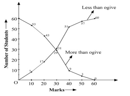
Remark:
- The class interval should be continuous to make the ogive curve.
- The x-coordinate at the intersection of the less than and more than ogive is the median of the given data.
EXERCISE 14.4
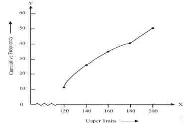
- The following distribution gives the daily income of 50 workers if a factory. Convert the distribution above to a less than type cumulative frequency distribution and draw its ogive.
Solution: Convert the given distribution table to a less than type cumulative frequency distribution, and we get
From the table plot the points corresponding to the ordered pairs such as (120, 12), (140, 26), (160, 34), (180, 40) and (200, 50) on graph paper and the plotted points are joined to get a smooth curve and the obtained curve is known as less than type ogive curve.
2.During the medical check-up of 35 students of a class, their weights were recorded as follows:
Draw a less than type ogive for the given data. Hence obtain the median weight from the graph and verify the result by using the formula.
Solution: From the given data, to represent the table in the form of graph, choose the upper limits of the class intervals are in x-axis and frequencies on y-axis by choosing the convenient scale. Now plot the points corresponding to the ordered pairs given by (38, 0), (40, 3), (42, 5), (44, 9),(46, 14), (48, 28), (50, 32) and (52, 35) on a graph paper an join them to get a smooth curve. The curve obtained is known as less than type ogive.
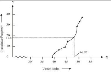
Locate the point 17.5 on the y-axis and draw a line parallel to the x-axis cutting the curve at a point. From the point, draw a perpendicular line to the x-axis. The intersection point perpendicular to x-axis is the median of the given data. Now, to find the mode by making a table.
The class 46 – 48 has the maximum frequency, therefore, this is modal class
Where, l = 46, h = 2, f1 = 14 , f0 = 5, f2 = 4
The mode formula is given as:
Mode = l + (f1 − f0)/(2f1 − f0 − f2 ) ×h
= 46 + 0.95 = 46.95
Thus, mode is verified.
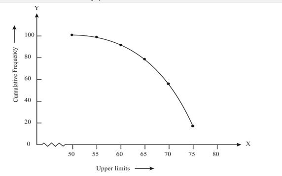
3. The following tables gives production yield per hectare of wheat of 100 farms of a village.
Change the distribution to a more than type distribution and draw its ogive.
Solution: Converting the given distribution to a more than type distribution, we get
From the table obtained draw the ogive by plotting the corresponding points where the upper limits in x-axis and the frequencies obtained in the y-axis are (50, 100), (55, 98), (60, 90), (65, 78), (70, 54) and (75, 16) on this graph paper. The graph obtained is known as more than type ogive curve.